WebChat Templates
Note
An Enterprise license or higher is required to access these features.
Disclaimer
The AnywhereNow default templates conform to WCAG 2.2. Changes to template structure, markup, or content may affect accessibility and compliance.
Almost every element of the webchat can be customized to create a unique webchat experience. The templates object should be defined as follows:
interface Templates {
    themes?: Theme[];
    floatingButton?: WebChatTemplate;
    topBar?: WebChatTemplate;
}
Components
Agent placeholder
Replaces the "Agent Placeholder" with the HTML added in the Template box.
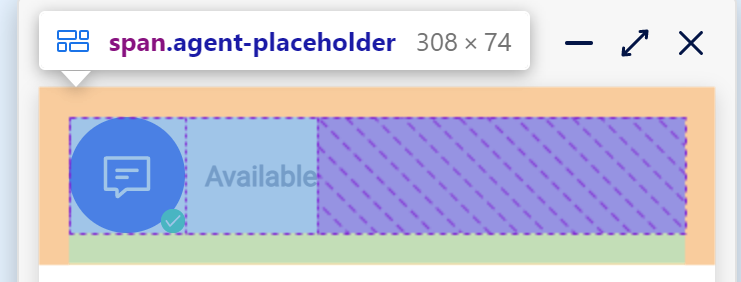
<span class="agent-placeholder">
   <div class="logo">
      <webchat-image src="resource:start-chat"></webchat-image>
      <webchat-ucc-presence-indicator></webchat-ucc-presence-indicator>
   </div>
   <div class="webchat-message">
      <webchat-title></webchat-title">
      <webchat-presence-text></webchat-presence-text>
   </div>
</span>
<style>:host {
    pointer-events: none
}

.agent-placeholder {
    display: flex;
    flex-direction: row;
    margin: 15px 15px 0 15px;
    padding-bottom: 15px;
    border-bottom: 1px solid var(--border-color)
}

.logo {
    background-color: var(--primary-color);
    display: flex;
    justify-content: center;
    align-items: center
}

.logo svg {
    width: 28px;
    height: 28px;
    transition: width 200ms, height 200ms
}

.logo {
    background-position: center;
    background-repeat: no-repeat;
    background-size: cover;
    transition: height 200ms, width 200ms;
    width: 58px;
    height: 58px;
    border-radius: 50%;
    position: relative
}

:host([small=true]) .logo {
    width: 45px;
    height: 45px
}

:host([small=true]) .logo svg {
    width: 21px;
    height: 21px
}

.webchat-message {
    font-family: Roboto, "Segoe UI Emoji";
    display: flex;
    flex-direction: column;
    align-self: center;
    padding-left: 10px
}

.webchat-message .title {
    font-size: 16px;
    font-weight: 600;
    color: var(--text-color)
}

webchat-ucc-presence-indicator {
    position: absolute;
    right: 0;
    bottom: 0
}

</style>
Connected agent
Replaces the "Agent Placeholder" with the HTML added in the Template box.
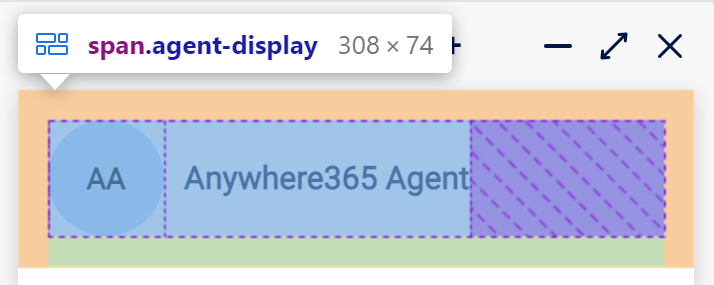
<span class="agent-display">
   <webchat-avatar size="large"></webchat-avatar>
   <div class="agent-info">
      <div class="name">{agentName}
      </div>
   </div>
</span>
<style>:host {
    pointer-events: none
}

.agent-display {
    display: flex;
    flex-direction: row;
    margin: 15px 15px 0 15px;
    padding-bottom: 15px;
    border-bottom: 1px solid var(--border-color)
}

.agent-info {
    font-family: Roboto, "Segoe UI Emoji";
    display: flex;
    flex-direction: column;
    align-self: center;
    padding-left: 10px
}

.agent-info .name {
    font-size: 16px;
    font-weight: 600;
    color: var(--text-color)
}

</style>
Notification
Replaces the "Notification" with the HTML added in the Template box.
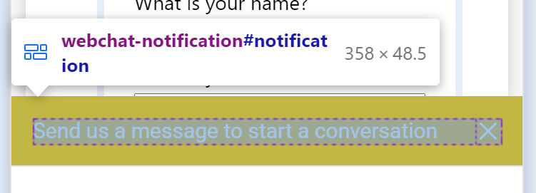
<div class="message-state">
   <div class="message-container">
      <webchat-notification-message></webchat-notification-message>
      <webchat-notification-accept></webchat-notification-accept>
   </div>
</div>
<webchat-notification-message-close></webchat-notification-message-close>
<style>:host {
    background-color: var(--notification-color);
    color: var(--color-white);
    font-family: Roboto, "Segoe UI Emoji";
    font-size: 15px;
    width: 100%;
    padding: 15px;
    display: flex;
    flex-direction: row;
    justify-content: space-between;
    align-items: center;
    box-sizing: border-box
}

.hidden {
    display: none !important
}

.close-button {
    margin-left: 15px
}

.message-state {
    flex: 1 1 auto
}

.message-state .message-container {
    display: flex;
    align-items: center
}

.message-state .message-container .accept-button {
    border: 1px solid var(--color-white);
    color: var(--color-white);
    background: transparent;
    margin-left: auto;
    font-size: 13px;
    font-family: Roboto, "Segoe UI Emoji";
    height: 30px;
    flex: 0 0 70px;
    border-radius: 2px;
    display: flex;
    align-items: center;
    justify-content: center;
    cursor: pointer;
    position: relative
}

.message-state .message-container .accept-button:focus {
    outline: none
}

.message-state .message-container .accept-button:hover::before {
    content: "";
    position: absolute;
    border-radius: 2px;
    top: 0;
    left: 0;
    width: 100%;
    height: 100%;
    background: var(--primary-color3);
    opacity: .25
}

.message-state.has-accept-button .message {
    margin-right: 15px
}

</style>
Start button
Replaces the "Start Button" with the HTML added in the Template box.
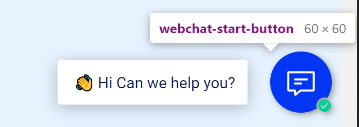
<div class="container">
   <div class="button-circle"></div>
   <span class="icon">
      <webchat-image src="resource:start-chat">
      </webchat-image>
   </span>
</div>
<webchat-unread-counter></webchat-unread-counter>
<webchat-ucc-presence-indicator></webchat-ucc-presence-indicator>
<style>:host(.unread-messages) .unread-counter {
    display: block
}

:host(.unread-messages) .button-circle {
    width: 23px;
    height: 23px;
    top: -18px;
    right: -65px
}

:host(.unread-messages) webchat-ucc-presence-indicator {
    display: none
}

.container {
    overflow: hidden;
    width: 60px;
    height: 60px;
    border-radius: 50%;
    position: relative
}

.container .button-circle {
    position: absolute;
    top: -15px;
    right: -61px;
    width: 16px;
    height: 16px;
    background-color: transparent;
    border: 60px solid var(--primary-color);
    border-radius: 50%
}

.container .icon {
    position: absolute;
    left: 50%;
    top: 50%;
    transform: translate(-50%, -50%)
}

.container svg *[fill]:not([fill=none]) {
    fill: #fff
}

.container svg *[stroke]:not([stroke=none]) {
    stroke: #fff
}

.container svg {
    transition: transform 200ms ease-in-out
}

.container:hover .button-circle {
    border-color: var(--hover-color)
}

.unread-counter {
    position: absolute;
    bottom: -3px;
    right: -3px
}

webchat-ucc-presence-indicator {
    position: absolute;
    bottom: 1px;
    right: 1px
}

</style>
Tease message
Replaces the "Tease message" with the HTML added in the Template box.
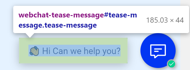
<span class="message-content">
   <webchat-tease-message-text></webchat-tease-message-text>
</span>
<style>:host {
    box-shadow: 0 3px 15px var(--box-shadow-dark);
    background-color: var(--background-color2);
    padding: 12px 12px 12px 16px;
    border-radius: 3px;
    opacity: 1;
    transition: opacity 200ms;
    white-space: nowrap;
    display: block
}

.message-content {
    font-family: Roboto, "Segoe UI Emoji";
    font-size: 15px;
    color: var(--text-color)
}

</style>
Top bar
Replaces the "Tease message" with the HTML added in the Template box.
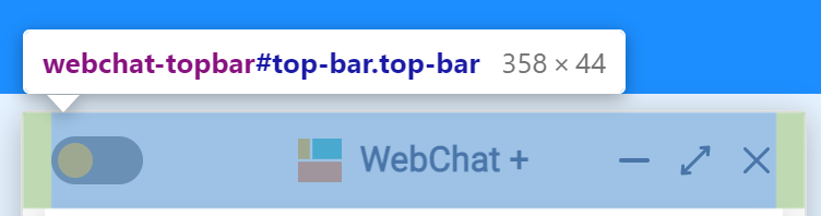
<div class="topbar-container">
   <webchat-theme-button></webchat-theme-button>
   <span class="top-logo-placeholder"></span>
   <span class="top-logo">
      <webchat-image src="resource:webchat-logo"></webchat-image>
      WebChat +
   </span>
   <span class="bar-buttons">
      <webchat-minimize-button class="minimize-button"></webchat-minimize-button>
      <webchat-maximize-button class="maximize-button"></webchat-maximize-button>
      <webchat-close-button class="close-button"></webchat-close-button>
   </span>
</div>
<style>:host {
    height: 44px;
    box-sizing: border-box;
    width: 100%;
    background-color: transparent;
    padding: 0 13px;
    display: block
}

.topbar-container {
    display: flex;
    position: relative;
    height: 100%;
    align-items: center
}

.topbar-container .top-logo-placeholder {
    flex: 1 1 auto
}

.topbar-container .top-logo {
    position: absolute;
    width: 100%
}

.top-logo {
    display: flex;
    justify-content: center;
    font-family: Roboto, "Segoe UI Emoji";
    font-size: 16px;
    font-weight: 600;
    color: var(--text-color);
    pointer-events: none
}

.top-logo svg {
    width: 20px;
    height: 20px;
    margin-right: 8px
}

.bar-buttons {
    display: flex
}

.bar-buttons :not(:first-child) {
    margin-left: 10px
}

@media (max-width: 700px) {
    .maximize-button {
        display: none
    }
    .top-logo {
        margin-left: 4px;
        width: calc(100% - 92px)
    }
}

</style>